It was over a year ago that the pandemic first pushed promotional products companies to the brink. To survive, distributors and suppliers had to adapt and get creative. They made new products, serviced new markets, even launched completely new business models. In short, they reinvented themselves.
ASI Media is celebrating that resourcefulness with “Reinvention Week” – a series of stories that honor promo’s ingenuity and explain how to stay agile in the face of future challenges.
To survive for the long-term, brands need to reinvent themselves. It could be a new logo or brand name, or perhaps a new product or service. No matter what, change of some kind is necessary.
At the world’s biggest brands, these moves are usually quite costly. Better that they be smart decisions, founded on solid market research, rather than hasty miscalculations attributed to misreading the target audience. But one thing’s clear: even the big guys can make huge missteps and be roasted for it for years – sometimes decades.
Read the other published stories in this series:
Reinvention Songs: Inspiring Tales From The Pandemic
Staying Ahead of the Curve
4 Ways to Reinvent Your Business
Coming Full Circle: A Q&A With Lou Weisbach
Here are six brands that reinvented an aspect of their business, to acclaim or groans, and how business owners can take heed.
New Services

Success
Netflix: Streaming Access for All
Remember the days when Netflix sent you DVDs in the mail? (It still does, by the way.) The company had big ideas back in 2007: to transition from processing physical discs to providing streaming movies and TV shows and giving consumers more opportunities to binge. The space was uncrowded by competition, so Netflix was able to negotiate affordable licensing agreements that allowed it to offer streaming movies and shows.
“The time is right for Netflix to take the first step,” said CEO Reed Hastings at the time. “Over the coming years we’ll expand our selection of films, and we’ll work to get to every internet-connected screen, from cellphones to PCs to plasma screens.”
— paola (@wordsarefriends) March 17, 2021
The company’s big break came in 2013 with House of Cards, their first original programming series. By the end of that year, it had more than 44 million subscribers, an increase of 33% from 2012, and total revenue of $4.3 billion.
Netflix was well positioned to capitalize on the inordinate amount of time spent at home this year. In fact in 2020, the service added a record 37 million subscribers, bringing the global total to more than 200 million for the first time. It’s now the world’s largest streaming service, with original programming and streaming rights for countless series and movies.
Lesson: Look ahead to what customers will want down the line, even if they’re not expressly asking for it yet. Netflix saw DVD demand falling among consumers and capitalized on streaming technology when it was still relatively cheap, allowing them to diversify smartly.
Flop
LEGO: Back to Building Basics

In 2003, LEGO was in trouble. The famed Danish toy company, founded in 1932, was still cranking out its signature toy sets, but had also gotten into clothes, LEGOLAND amusement parks and computer games. And it was taking a toll on the company’s financials. The budget deficit stood at $220 million, and 1,000 employees were laid off the next year due to budget cuts. The diversification strategy wasn’t working.
The company finally realized they couldn’t be everything to everyone. When the new CEO, Jørgen Vig Knudstorp, came onto the scene in 2004, he did away with computer games (which were unprofitable); handed over the amusement park reins to Merlin Entertainments; slimmed down the LEGO pattern book to just half of the 13,000 distinct pieces the company produced (many of them cost-prohibitive); and pursued pop culture licenses, like Star Wars, Harry Potter and Disney. In sum, he refocused operations on what they did best: building play construction sets.
By the final months of 2018, operating profit had reached $1.6 billion. Since then, the company has shown steady growth, including a 14% sales increase in the first half of 2020 as homebound families put in quality time playing with LEGOs.
“During the first half [of 2020] we attracted new builders of all ages who turned to LEGO play to help them through difficult times,” said LEGO Group CEO Niels B. Christiansen, in a financials report in September. “More families are playing and learning together with LEGO bricks and we are seeing more adults than ever before enjoying building our more challenging sets.”
Lesson: Getting back to basics and monitoring profit-and-loss can help a company start performing again.
New Products
Success
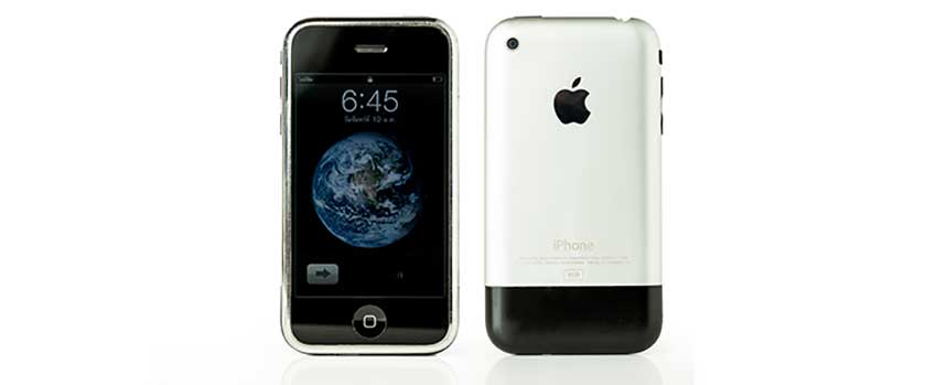
iPhone: Changing Communication Forever
It’s one of – if not the – most successful product launches of all time. Just 14 years ago, Apple CEO Steve Jobs announced the first-generation iPhone. Today, according to Apple, there are now 1.65 billion iPhones in use all over the world. Chances are, you’re reading this article on one.
Apple had long been known for its tech devices – the company was established in 1977 by founders Jobs, Steve Wozniak and Ronald Wayne in Jobs’ garage as a small business for developing and selling personal computers, a novel idea at the time. By 1985, Jobs had left the business to found NeXT Computer, and by the 1990s, Apple was struggling. In fact, Apple bought NeXT to bring back Jobs when the company was just weeks away from bankruptcy.
In January 2007, Jobs unveiled the first iPhone at the Macworld Expo; the company sold 270,000 units in 30 hours. “An iPod, a phone and an internet communicator,” said Jobs at the unveiling. “These are not three separate devices: This is one device, and we are calling it iPhone.”
Is already slightly annoyed at the word "iPhone" and thinks before seeing one (in 10 monthes or so) he'll definitely hate the thing.
— Riccardo Cambiassi (@bru) January 9, 2007
The device offered power unrivaled at the time: a phone, internet browser, media player and game console all in one. Soon, it became integral to daily life. And because of the forward-thinking designers and engineers at Apple, communications will never be the same again.
Lesson: Jobs and his team looked ahead to a need people didn’t even know they had yet: beautifully designed lifestyle pieces that facilitated many burgeoning technology demands, like e-commerce and gaming. Instead of trying to fill an existing need, create one.
Flop
New Coke: Not the Real Thing
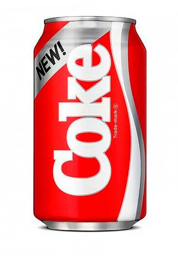
In April 1985, Coca-Cola released a new formulation of its classic cola, dubbed “New Coke.” While it was still the world’s top soft drink, the company had been steadily losing market share to non-cola options and in blind taste-tests, people seemed to prefer Pepsi. So, in an effort to rejuvenate the product, they reformulated it for the first time in almost 100 years and mothballed the old formula.
The backlash was loud and swift. Complaint calls to the company’s hotline increased by 275%. People panic-bought and hoarded bottles containing the original formulation, and formed protest groups like “Old Cola Drinkers of America.” Within three months, the company brought back the old recipe and rebranded it as Coca-Cola Classic, though they kept New Coke on shelves until 2002 (by then, it was known as Coke II).
“We set out to change the dynamics of sugar colas in the United States, and we did exactly that — albeit not in the way we had planned,” said Roberto Goizueta, the CEO who oversaw the development of New Coke in 1995. “It sent an incredibly powerful signal … that we really were ready to do whatever was necessary to build value for the owners of our business.”
All told, the reformulation cost $4 million and Coca-Cola was left with more than $30 million worth of unused New Coke concentrate.
Lesson: Don’t fix what ain’t broke. Listen to customers and make improvements based on feedback, but be careful of wholesale overhauls; they can alienate clients who buy based on habit and loyalty.
New Logos

Success
Starbucks: A Subtle Siren Call
In 2011, world-renowned coffeehouse chain Starbucks tweaked its logo, keeping the distinctive green hue, removing the text referring to coffee and enlarging the “siren” figure (usually mistaken for a mermaid).
By that time, the coffee chain had been serving up java and tea for 40 years. It got its start in Seattle’s Pike Place Market, with a brown and white logo depicting a sea siren from a 15th-century woodcut (that stayed in place until 1987). About a decade later, businessman Howard Schultz bought the company with a plan to focus on more espresso drink options and headed aggressive expansion across the country through the 1990s. Today, it’s the world’s largest chain of coffeehouses, with nearly 30,000 locations around the globe.
“Throughout the last four decades, the siren has been there through it all,” said then-Chairman and CEO Schultz on the logo change in 2011. “And now, we’ve given her a small but meaningful update.” He added that the change “embraces and respects our heritage, and at the same time evolves us to a point where we feel it's more suitable for the future.”
After 40 years, and several iterations of brand image, the company gave the logo a subtle update, leaning on its legacy brand status and the iconic image of its famous female figure that harkens back to Seattle’s seafaring history.
Lesson: A legacy brand that’s also a status symbol, Starbucks made the update smartly: keep core aspects in place, streamline and enhance key elements.
Flop
The Gap: Market Research Disconnect
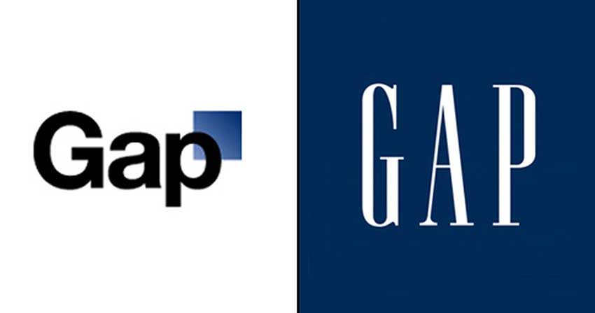
In one of the most infamous marketing mistakes in recent history, clothing retailer The Gap decided to change its logo in October 2010, just ahead of the Q4 holiday rush, without any warning or fanfare. Overnight, the 40-year-old signature navy blue box with authoritative capital letters was seemingly history. The new logo featured a softer font in black, with just a small blue square that evoked the old one.
It lasted just a few days before swift backlash from consumers forced the company to retract it and return to the original logo.
What happened? At the time of the unveiling, the brand, founded in 1969, said the refresh marked its transition from “classic, American design to modern, sexy, cool.” Marka Hansen, then president of Gap North America, said that the new logo honored the store’s “heritage through the blue box while still taking it forward.”
The public didn’t agree. Tom Scocca wrote in Slate: “It looks like the emblem of some failed low-fare spinoff of a major airline.” Customer criticism proliferated on social media: a protesting Twitter account gained 5,000 followers and a website featured parodies of the new look. One user even created their own unsanctioned @GapLogo Twitter account to stir up even more clamor.
I hear Facebook is launching a new re-design tomorrow. Maybe all you Don Draper hacks can make fun of The Zuck tomorrow instead of me?
— Gap Logo (@GapLogo) October 6, 2010
The pressure became too much, and The Gap changed back to the original logo a week later. Reports estimate that the days-long rebrand cost $100 million.
“We will bring it back across all channels,” said Hansen. “We’ve learned a lot in this process. And we are clear that we did not go about this in the right way. We recognize that we missed the opportunity to engage with the online community.”
Lesson: Brands – especially well-established legacy ones – evoke loyalty and security, and their logos are symbols of that. A complete overhaul can instantly alienate the fans a company spent years winning over.
Read the other published stories in this series:
Reinvention Songs: Inspiring Tales From The Pandemic
Staying Ahead of the Curve
4 Ways to Reinvent Your Business
Coming Full Circle: A Q&A With Lou Weisbach